CRED Design
manifesto
Back in 2018, when we started designing the first-ever version of the CRED app, we had one single goal - to build the most beautiful digital experience for our members. Something that works efficiently with a deep focus on creating moments of delight. Our design systems have gone through several phases of innovation and metamorphosis but our goal has remained the same - Be the most beautiful experience for our members, every single time.
What's beautiful, you may wonder - For us, being fast is beautiful. bringing joy at every step is beautiful. Creating something that works every single time, time over time, is beautiful. Crafting something that is deeply driven by art, is beautiful. Something that makes an honest effort at being beautiful, is beautiful. Making something that functions like how you’d like it to or even better, is beautiful.
Being beautiful is central to what we do. That's what we wake up to every day, that's what we go to sleep to. The need to build with great artistry, craftsmanship, and passion has led us to push our envelope several times through our journey. Our members have been the biggest pillar of support and the biggest driver that has enabled us to work harder, learn from our mistakes, and continuously push the boundaries on what's possible. Our members have been our most vocal supporters, our most vocal critics, and our most valued evangelists.
Art is at the heart of everything that we create. What has art got to do with product design, you may wonder. Through the years one of the most critical outcomes of design - that it should solve a problem - has been confused with the idea of design itself. Design’s purpose stretches way beyond just solving a problem. For us, design should inspire creativity, design should bring out emotions, design should delight, design should seek a purpose beyond the most obvious and most importantly, design should touch humans in ways beyond our collective imagination.
Our design always attempts to inspire our members to feel and perceive their everyday tasks or even everyday objects with a sense of artistry and delight. For a category-breaking, a genre-bending product like CRED, which has offerings as diverse as payments to e-commerce, arcades to investments, our design language is a powerful glue that binds together our member experience, in an unconventional yet incredibly consistent way.
At the core of every engineering solution we build, every single line of code that we write, there is an ever-burning desire to bring art to life. To make it perceptible to our members every time they open the app, touch a button or move a slider. Making every aesthetically crafted experience work like magic, at peak performance. We set an incredibly high bar for the stability and reliability of our creation, no matter how big or small. Building frameworks and systems that enable us to create with efficiency and limitless creativity is central to our philosophy. Our design systems are sophisticated, future aware, backward compatible, and built to ensure that every feature, every little piece of design can be created to look like how they looked on a designer’s screen. Because when it’s beautiful, it brings joy to our members. It brings a sense of accomplishment to our members. It touches their lives in small, yet meaningful ways. That’s the idea behind CRED. To be that community that binds our members together, keeping their success and aspirations at the top of our minds.
the evolution of design at cred
Circa 2018
Topaz

minimalism
illustrative
the first generation of CRED design system, Topaz is what powered the app during its launch. Built on the principles of flat and reductionist minimalism, simple typography built specifically to highlight numbers, and an in-context, high-performance payment system, Topaz went on to become the pillar of all future design manifestations of our payment systems.
along with Topaz, we debuted a striking new illustrative and motion library, appropriately titled “Cyborg”, inspired by 90’s sci-fi. Topaz also featured completely hand-baked merchandising and had one of the most sophisticated native implementations of Lottie-based animations yet. This marked a definitive new trend in the way motion design was used in traditional apps.
scroll horizontally to see more
Looking ahead of TOPAZ
Topaz was created specifically for credit card payments and the subsequent reward granting mechanism. The next stage of evolution required us to become faster and more efficient with changes and extensibility while keeping the core design ethos intact. A great deal of user data came in which was then used to abstract the key member feedback to actionable outcomes. This marked the beginning of the next chapter in CRED's design history.

Circa 2019
Fabrik

bold
Skeuomorphic
a bold and maverick design direction for CRED, Fabrik retained the key design principles that defined our design decisions while embellishing it with more advanced, usable, and beautiful design constructs. Fabrik was built on simple UI principles, yet it created an understated but profoundly recognizable design style. Fabrik made the app easier to navigate, and easier to explore while continuously delighting our members at every single step. Visually, the use of skeuomorphic card designs, an improved statements feature, and most importantly a first-of-its-kind rewards interface that featured a top-of-the-line, high-fidelity bespoke merchandising.
scroll horizontally to see more
Looking ahead of FABRIK
Fabrik as a system was well suited for transactional flows while the new universe of CRED required stronger data visualization capabilities. The need for a more sophisticated componentized and assembly-ready system where the design and front-end systems could come together cohesively and create components and systems programmatically became imminent.

Circa 2020
Copper

neumorphism
physical
with Copper, CRED shipped the first-ever, fully customizable, back-end driven, hyper-componentized design system and a brand new UI library “Synth” built on the principles of a bleeding-edge design trend: neumorphism.
this was the first time CRED moved away from a reductionist approach to a more physical metaphor-driven user interface. More than just the UI system, what Copper achieved was that we successfully managed to create and ship a framework that was extensible to the extent that several key products on the app could now be controlled entirely via our centralized content management system "heart beat".
this was the first time CRED moved away from a reductionist approach to a more physical metaphor-driven user interface. More than just the UI system, what Copper achieved was that we successfully managed to create and ship a framework that was extensible to the extent that several key products on the app could now be controlled entirely via our centralized content management system "heart beat".
synth was the first-ever commercial implementation of neumorphism globally, subsequently open-sourced to be leveraged by the developer community.
scroll horizontally to see more
Looking ahead of COPPER
as CRED rapidly scaled to a true multi-genre product, the need for a design system that imbibed the diverse design needs of the various product offerings while binding it all together consistently became our next big goal. The pursuit of finding that perfect visual and functional balance that flows seamlessly between e-commerce to payments, lending to rewards lead to the launch of our fourth generation design system - NeoPOP.

The anatomy of NeoPOP system
FONTS
a fresh new font Cirka was added to compliment our existing typography system. The addition of the new font increased the scalability of our type system helping us communicate with our members across product, brand, and visual merchandising consistently.

Illustrations and Motion
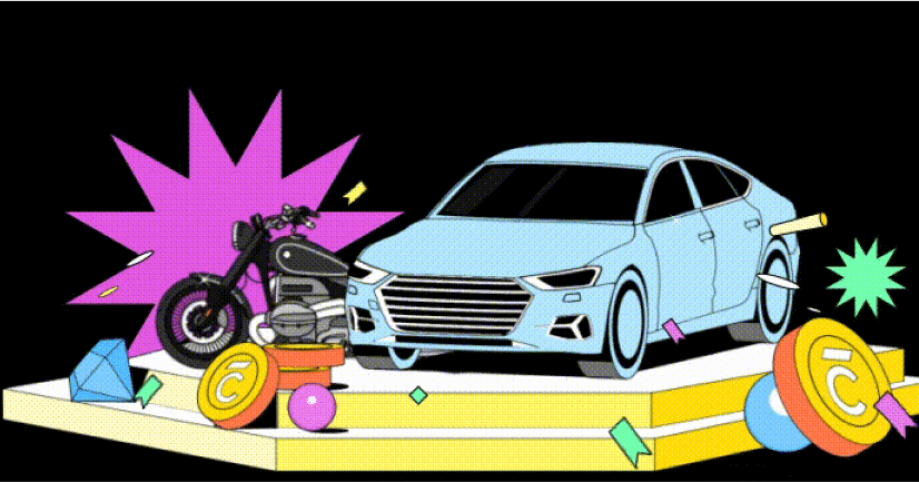
inspired by the NeoPOP art movement, our creative and motion design imbibes the principle of turning everyday objects into true art. Bold and Colorful, our new design languages seamlessly bring principles of isometrics, linear motion, and pseudo-morphism to create delight in every pixel while communicating the message succinctly and clearly.
application
examples
illustrations
banners
descriptive icons
other implementations
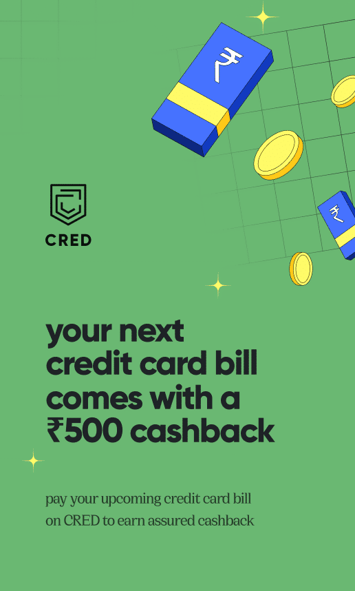
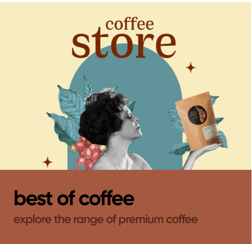
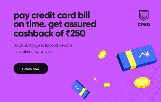
NeoPOP extends into our marketing and visual merchandising spaces, making them more bold, bespoke and beautiful than ever before.
scroll horizontally to see more



experience flow
the component and grid masonry is crafted to create beautiful, unique permutations of interface elements. It is extensible, API backward compatible and highly measurable which makes experimenting on our product exponentially effective.
information. in the spotlight.
a clear information hierarchy helps puts the most important elements in focus.
mundane made fun.
relooking basic templates through the lens of the NeoPOP philosophy enables the creation of fresh component assemblies quickly and consistently.
an extension of the real world
from fonts to texture and interaction animation, neopop recreates the real world experiences.
a grid that optimizes space
the all-new elements are designed to showcase maximum information in a fold while keeping a delightful amount of negative space.
buttons that you can't resist
high contrast, accessible, haptic-aware, multi-state, mutl-elevation buttons help you to take the right actions - Consistently.
scroll horizontally to see more
the way forward
we at CRED believe in sharing our work and our learnings to the benefit of the larger community. In that spirit, NeoPOP library will be opensourced in the coming months for the community to leverage and enhance.
after all, with great beauty comes great responsibility.